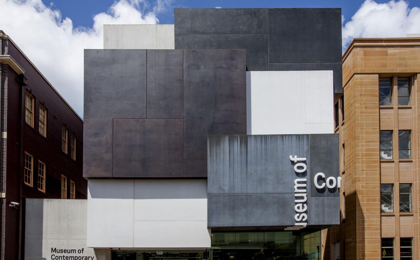
Museum of Contemporary Art | Sam Marshall
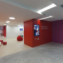
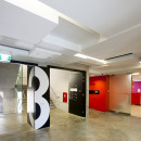
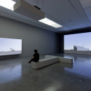
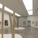
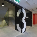
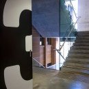
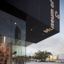
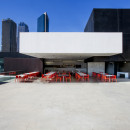
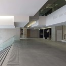
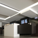
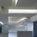
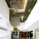
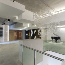
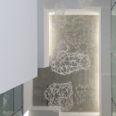
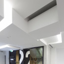
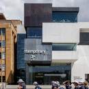
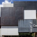
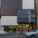
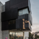
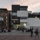
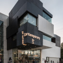
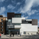
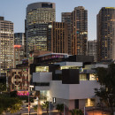
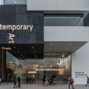
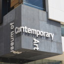
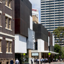
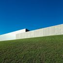
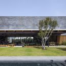
11-22-2015:MODERNi: The unobstructed display of art was of primary importance. The source of the built form was the white box that is the starting point for the MCA’s exhibition design. The voids between such boxes allow selective views out as well as views deep into the activity of the interior. The external articulation of these boxes reconciles the scale shift from the small of George Street to the huge of Circular Quay. The entrance passage took its cue from the surrounding topography and urban fabric to create an entry between the different levels of George Street and Circular Quay. This open gesture invites people in. Being viewed from all angles, there is no back, front, top or bottom. Internal circulation is intentionally simple. Amongst many other environmental initiatives, a seawater exchange system saves 30% on energy costs. The building is clad in glass reinforced concrete panels that allowed massive singular panels that fold around corners, under as ceilings and over as roofs without joints. This along with bold signage further expressed the box forms...Read More!



5 Comments