Vermon Artist House | Elizabeth Herrmann
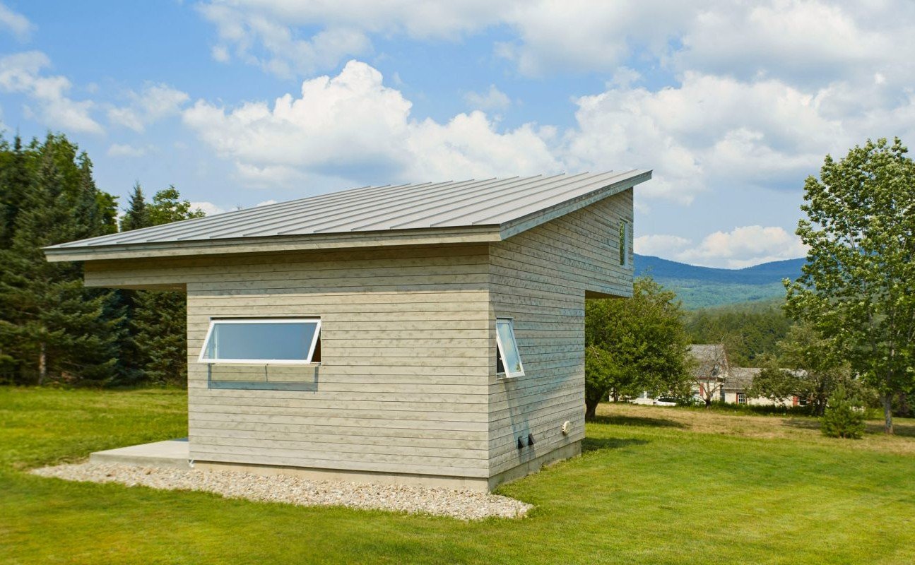
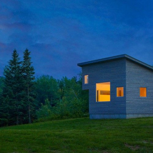
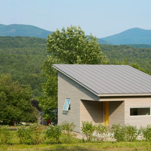
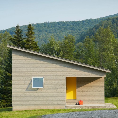
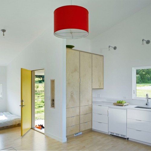
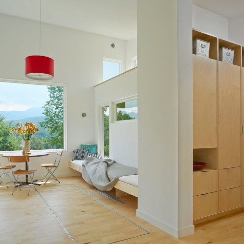
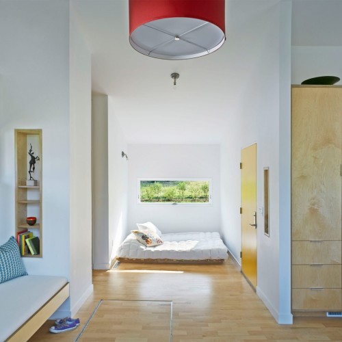
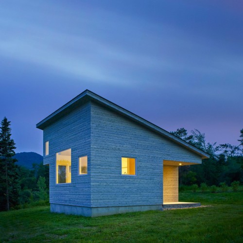
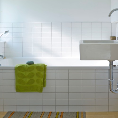
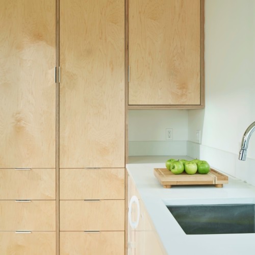
12-25-2017:ArchDaily: The program was simple: a bathroom (tub, no shower), sleeping area, kitchen , clothing and household storage, dining/work table, living space that could double as guest sleeping, and a sleeping loft. So that the upstairs wouldn’t be cluttered, the program also included a full basement to store additional items, mechanical equipment and laundry machines. (A hatch door camouflaged to blend with the floor opens up easily for basement access.) Though open in plan,the living level was sculpted so that each of the different areas of use have definition and a sense of place, without being static or confining, and so that the house could comfortably accommodates visitors. Framed views help define interior spaces and give each “room” a distinctive focus with plenty of daylight and ventilation. The primary view at the heart of the house is Camel’s Hump, a Green Mountain peak, framed by a large, picture window;Modern Design…Read More!



6 Comments